Brand in action
The design system is a contract, not a gallery of mocks. This page shows the contract honoured — real surfaces from apps/web, apps/app, and apps/docs, with the components and tokens they consume called out so you can read from "this is what I want to build" → "this is the component / token I reach for" in one sweep.
How to read this page
Each card pairs a screenshot of a real surface with:
- Components — every documented component in the surface, linked to its page.
- Tokens — the headline tokens (bloom variant, surface family, accent palette) the surface leans on.
Every screenshot is captured at 1280×720 from a live consumer; the screenshot library lives under apps/design/public/brand-in-action/. The capture workflow is documented in that directory's README.md.
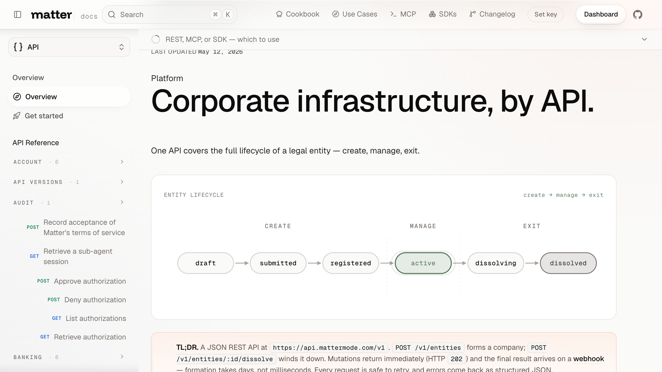
Live surfaces
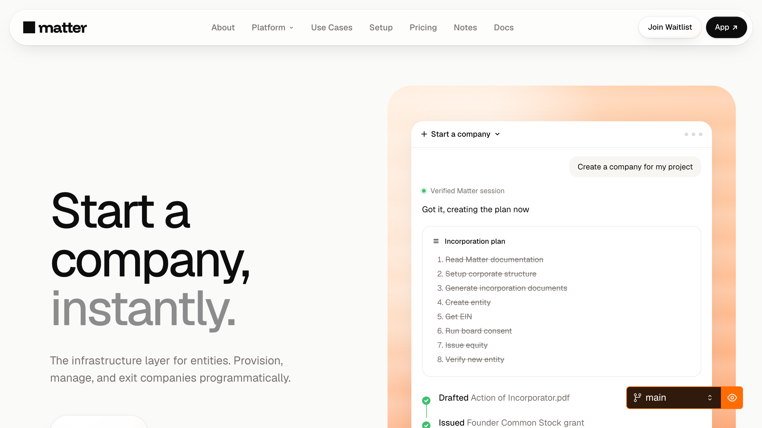
Marketing hero — apps/web
BloomBackdrop (peach), Glass overlay, DisplayHeading mega, MatterButton primary + outline.
--bloom-peach--surface-glass--action-primary
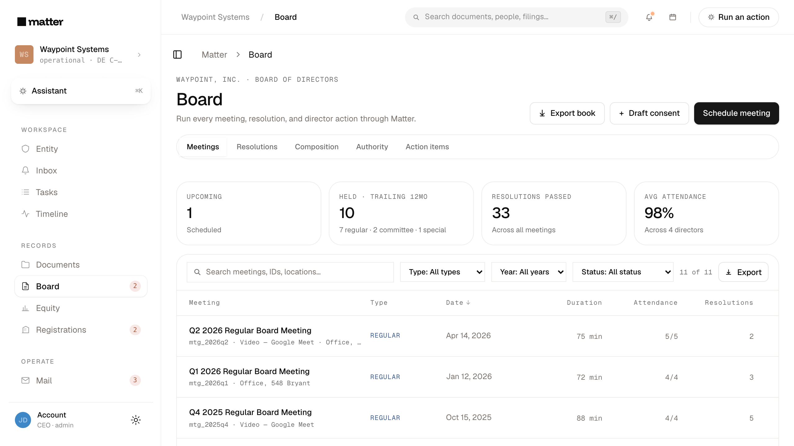
Dashboard / Board — apps/app
AppBreadcrumb header, Card grid for agenda + materials, BoardConsentCard inline with pending consent, Timeline activity feed in the rail.
--bg-elev--border-soft--status-amber-bg
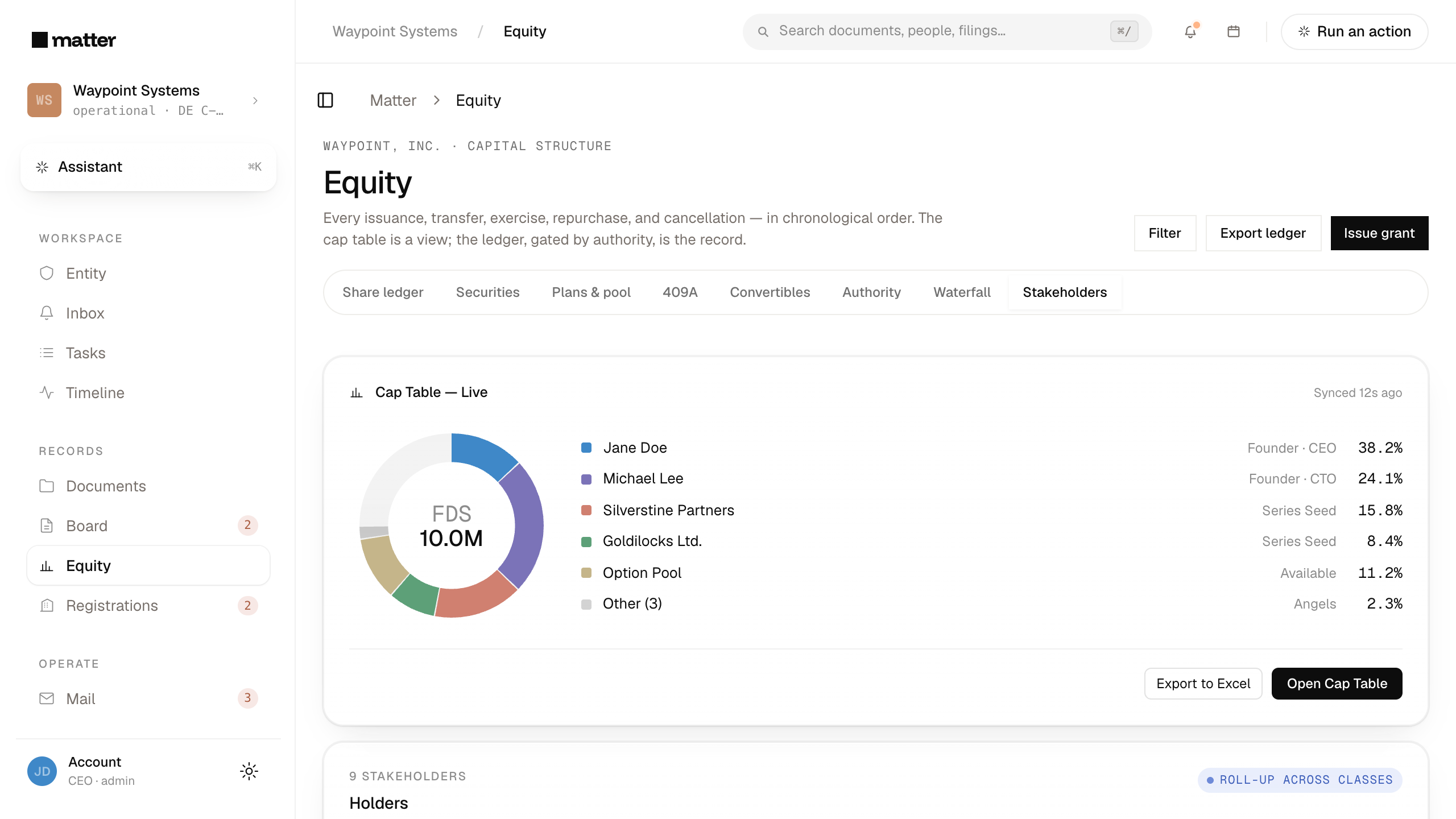
Dashboard / Equity — apps/app
CapTableSnapshotCard hero with the live donut + holder list, share-class table below, drafted OptionGrantCard awaiting approval in the rail.
--action-create--gold-warm

Assistant composer — apps/app
Composer with Tahoe-glass refraction over a BloomBackdrop, ComposerChip row for attach + model picker, InlineToolCall trail in the reply thread.
--surface-glass--composer-lens
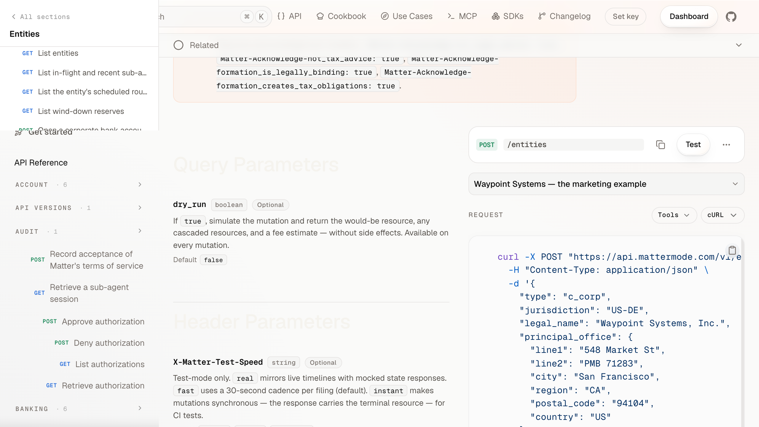
API reference — apps/docs
Operation column with EndpointBadge header, CodeBlock with header slot for request / response, Scalar playground embedded in the TOC rail.
--method-post--code-surface
Docs corpus — apps/docs
Pill-shaped Cmd+K search, lifecycle-grouped grids of EndpointBadge cards, Eyebrow section anchors.
--bg-2--matter-method-*
What this page is
The gallery is the production face of the design system. Every entry shows a real surface a real user sees — the marketing hero a prospective customer reads, the dashboard a founder works in every day, the API reference a developer comes back to.
When a new consumer app or surface ships, add an entry here. The bar is "a representative screen that exemplifies how the design system shows up in this surface." Don't ship per-flow screenshots; one per surface is the right grain.
What this page isn't
- Not a marketing gallery. No mocks, no hero illustrations, no aspirational renders. Real surfaces only.
- Not a tutorial. For the implementation walkthrough of a surface, the Recipes section is the right place.
- Not a per-component catalogue. That's Components. Brand-in-action is "how the system composes," not "what the parts look like."
Maintenance
Screenshots drift. When a consumer surface changes meaningfully (a new layout, a token re-skin, a major component swap), update the corresponding entry's screenshot. A future tranche wires this into Playwright + Chromatic for automated visual regression; until then, screenshot maintenance is on the author of the surface change.
The screenshot manifest lives in apps/design/components/brand-gallery.tsx. Adding a new entry there + a new PNG under public/brand-in-action/ ships the new card.
Agents
How AI agents consume the Matter design system. JSON manifest, JSON Schema, llms-design.txt, per-page raw MDX, version pinning. Worked examples and the contract.
Changelog
What's landed in each release of @matter/tokens, @matter/components, @repo/brand, and the design site. Derived from git history at build time.